SUPERLIST // STRATEGIC BRAND CREATION FOR BETA
Building the future of to-do's

BACKGROUND / STORY
Supportive, mindful productivity for everyone
Five years on from its sale to Microsoft, the founders of the highly popular Wunderlist app regrouped to found Superlist - a productivity tool that bridges the gap between personal and team management.
A fast, flexible, highly customizable general purpose tool, Superlist collaborates and enhances your workflow, rather than challenge it.
With the product still in concept phase, and with no visual identity in place for marketing & investment, I worked alongside the founders to create the brand foundations and subsequent visual identity ahead of the Series A funding in January 2022.
By running a series of interviews and workshops involving the core team of founders, product designers and developers, I was able to establish the foundation for the brand and help form the initial vision, purpose and values of the brand. In turn, these values would translate directly to the brand personality and inform the beginnings of the tone of voice.

THE BIG IDEA
Superlist celebrates the uniqueness
of the user and provides supportive, mindful productivity to everyone,
and in turn, supercharges the teams they are a part of.
BRAND PURPOSE
Empowering people, supercharging teams
The initial foundation work provided the framework for a creative brief, which alongside competitor and audience research allowed for the exploration of several creative solutions.
Following feedback and input from the core team and investors, a single creative thought emerged that not only provided us with guiding principles for our visual language, but allowed us to strengthen the brand foundation and formalise the purpose, values and tone of voice, alongside the development of the visual identity.
CREATIVE PLATFORM
Be Super
Superlist's mission is to celebrate the sense of accomplishment that comes with being productive; enabling individuals with effortless organisation and supercharging the teams they are a part of.
Superlist allows individuals and teams to Be Super.


DESIGN
A Wonderful nod
to heritage
As one of the most popular and powerful project management apps for individuals and teams, Wunderlist amassed a dedicated following that are eager to use Superlist. Given the love for it’s predecessor, it was a fun challenge to reward the audience with several subtle ‘easter-eggs’ within Superlist’s visual identity, all based around the 24-degree angle of the Wunderlist ribbon.


Wordmark
A bold, contemporary sans serif font formed the basis of the wordmark, which borrowed the 24-degree angle featured on the Wunderlist logo. The angle was applied at key visual points of the overall form, representing the founders and investors of the new brand.


Introducing The Flow
"Flow - the optimal state of being in which a person performing some activity is fully immersed in a feeling of energised focus, full involvement, enjoyment and satisfaction in the process of the activity."
The Flow is an essential part of Superlist’s brand expression, representing the “optimal experience” and the the dualism
of our audience: individuals and teams. This symbolism of the balance of the two personas and acknowledging that teams consist of many unique individuals, is the visual representation
of our brand purpose.


App icon
With a nod to the skeuomorphism of the original Wunderlist app icon, Superlist goes against the predictable and flat iconography of the competition and creates something tangible and noticeable in your dock. Immediately recognisable, the app is on hand whenever the user needs.
The first icon of it’s kind to have an on/off state, The ‘supercharged’ on-state light signifies the life and energy within the brand, and the power it provides.


Typeface: Brand presence without a logo
Superlist Headline is a bespoke typeface influenced by Aeonik Bold; a geometric sans serif font created by Mark Bloom and Joe Leadbeater at CoType Foundry.
Inspired by the Wunderlist ribbon, and the approach taken
to the wordmark, the 24-degree angle was subtly (and sometimes, not so subtly!) incorporated into the Aeonik form to create a much more human, approachable and recognisable brand font.


User-centric 3D Models
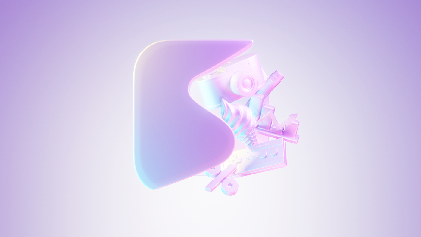
All core imagery is expressed through specifically created 3D assets, guided by two principles; ‘Elegant Simplicity’ and ‘Inspired by life’.
In order to communicate the everyday functionality of the product and the versatility of it's use, a series of 3D models were commissioned to be used to support and represent user profiles.


BRAND WORLD
Bringing the brand to life


THE FUTURE
Superdynamic
Based around a series of 'skeleton' assets inspired by The Flow - this dynamic identity can be customised or inspired by the audience, partnerships or events. and in doing so, the engagement and longevity of the brand is extended and open to any number of creative interpretations.

SUMMARY
Funding secured
The work shown above was the result of one year's work, that began by creating the brand foundation - story, mission, purpose, values, personality and tone of voice - and realising all of this through the visual identity.
Superlist launched their beta product in late 2021, ahead of their final round of Series A funding, upon with they secured their maximum amount of investment. This has allowed the team to keep the product in development throughout 2022, with a planned launch of mid 2023.


