CHELSEA FC // GLOBAL REBRAND
Taking London's most successful club beyond football


BACKGROUND / STORY
Flying high...
Following the appointment of a new Marketing Director in April 2017, the club embarked on the first global rebrand in their 112 year history.
Working alongside the newly-appointed Head of Brand in my role as Creative Lead, I was responsible for the creative direction and implementation of the new brand at a strategic and creative level, across all touchpoints.

THE BIG IDEA
We are the London Club.
No one is as dramatic, ambitious and stylish as Chelsea.
Born to win, captivating fans
across the world.


STRATEGIC PLATFORM
Born to win, Chelsea style
Every football team in London has attempted to lay claim to being "London's Team", but very few have made it stick.
But very few London clubs are synonymous with their location - when you think of Chelsea, you think of the King's Rd, celebrity, fashion and quality.
West London - and specifically Chelsea - conjure images of glamour and style; exactly the kind of mental real estate you'd expect from London's most successful football club.
The club from the best location in the biggest city in the world, is attractive, dramatic and unique... they're the Pride of London.
With quality comes an unbeatable attention to detail. Moments of 'surprise and delight' found in high end fashion, run parallel to the high-performance mentality you expect from a club like Chelsea.


DESIGN
Refreshing the identity
With the new brand values, strategy and creative platform in place, the core assets of the visual identity - type, colour and imagery - were updated to create a more contemporary and consistent visual language.

Chelsea Basis
Working with Colophon Foundry, a bespoke cut of their contemporary sans-serif Basis grotesque was commissioned and evolved to include two headline alternatives; Chelsea Basis Outline and Chiselled.


Blue is the colour
With blue being a notoriously tricky colour to keep consistent, the brand palette was revised and tested to create a more reliable core colour-way. This is supported by lighter and darker tones, to allow for tonal depth, the use of gradients and identifying sub-brands and verticals


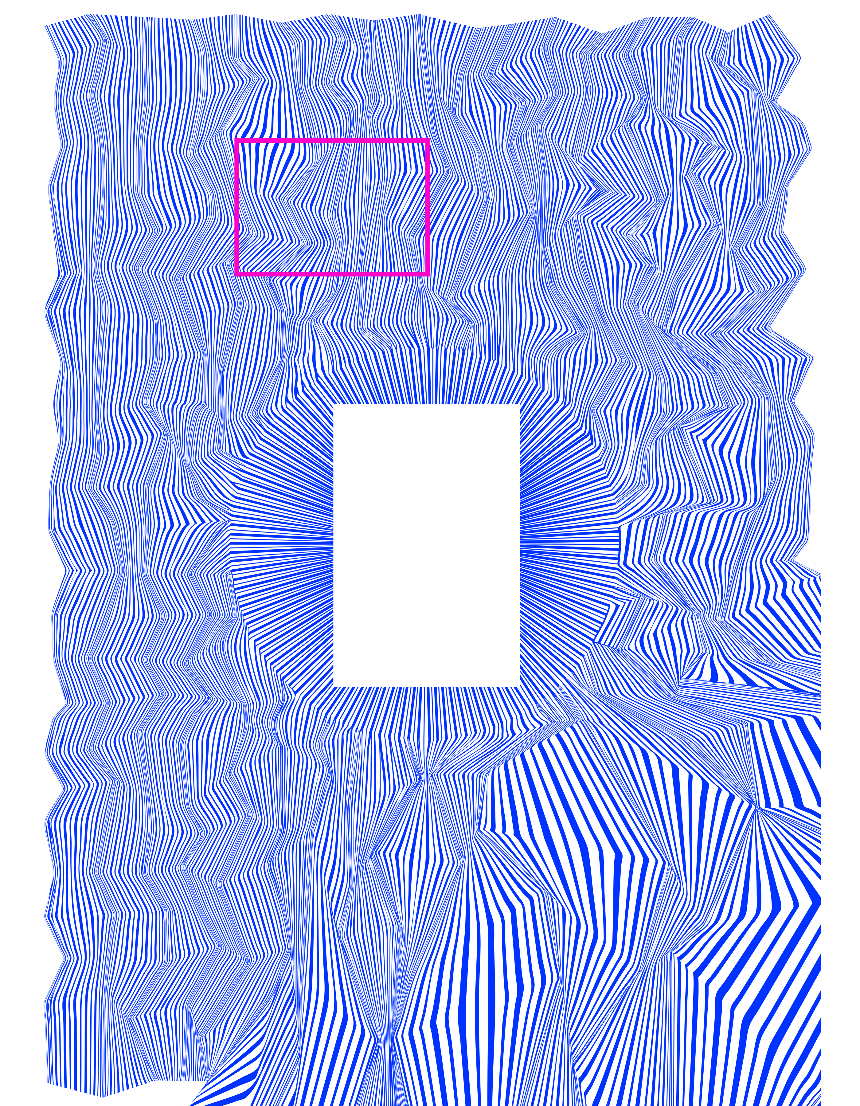
Introducing the Super Graphic:
Inspired by the future, created by fans
The visual identity is amplified by a unique brand pattern inspired by the architecture of the club's proposed new stadium. This pattern evokes a sense of movement and energy representing the sounds and emotion that build, fall and rise again over 90 minutes


BRAND WORLD
Bringing the brand to life


DESIGN
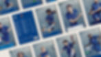
Matchday programme
Outside of social media, the matchday programme is one of the most popular and engaged touchpoints for fans.
To create something truly unique and bespoke, the dimensions of the magazine were taken proportionately from that of the Stamford Bridge pitch, and the grid that determined the layout was inspired by the traditional 8x16 chequered pattern of the grass cutting.
Using the revised colour palette, the four competitions would be represented in different colour ways, and the imagery would incorporate studio shots of the players designed to bring the audience closer to the player.
Given the quick turnaround of each edition, the design principles of the publication were shared with the editorial team over a two-day workshop, and subsequent designs were reviewed internally in the run-up to publication.
The same principles would be applied to the monthly magazine, which would instead have less of a matchday feel with static, lifestyle shots of the players against a calmer, predominantly white backdrop.


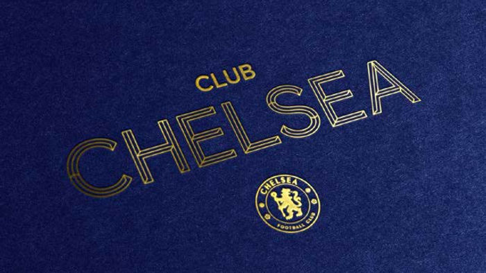
HOSPITALITY
London's finest
With a different target audience to that of the main brand, Club Chelsea became the only sub-brand within the brand architecture.
With business, entertainment and events to consider in addition to the passionately loyal fan base, the Club Chelsea visual identity is firmly routed within the master brand, but draws more heavily on the supporting assets, such as the darker, more luxurious palette and the lighter cut of the Chelsea Basis headline fonts, Outline.


DESIGN
Surprise & delight
Having established the visual identity of Club Chelsea, in accordance with the master brand, the design principles were applied to all hospitality and events collateral from promotional brochures, to ticketing and matchday menus.
This attention to detail and quality of finishing on each execution, should reflect the premium and luxury nature of Club Chelsea. This was achieved by a meticulous selection of materials, fabrics and print finishes, as well as causing moments of 'surprise and delight' usually reserved for high-level fashion brands.